NYFW trends: trellis, urban minimalism, 1960s influence

Trellis print
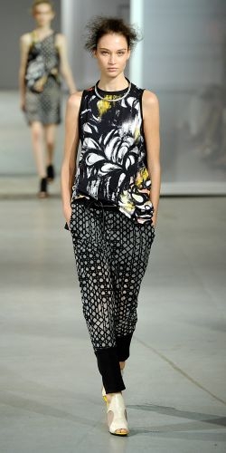
Following on from the recent Fall/Winter 2014 trend for checks, the trellis pattern appeared on the runway this season as a bolder update. At 3.1 Phillip Lim, the designer took his cue from the quilting on mattresses, working the trellis check throughout his collection. Elizabeth & James also employed the effect in the brand’s city-meets-surf pieces, most notably on their stunning semi-sheer shirts. Meanwhile at Proenza Schouler, Jack McCollough and Lazaro Hernandez opened with a thick trellis reworking of the classic plaid shirt, and then used the pattern in perforated leather pieces.
Urban minimalism
For another season the New York shows were mostly dominated by a sporty, pared-back take on urban clothing. Rag & Bone were key proponents, sending out slick and minimalist versions of summer coats, trenches and utility jackets. Victoria Beckham worked a similar vibe, but broke up her clothes’ clean lines with some brighter (but still restrained) prints and color. Tim Coppens was one of a series of designers (including Hood By Air who added a punkier element) who worked with New York City’s streetwear heritage.
1960s retro
Every season there are always a couple of designers who delve back into the past for their major inspiration, and this one was no different. Anna Sui, Tory Burch and Jeremy Scott all looked at the 1960s and 70s but in very different ways! As usual Scott went maximalist with his use of slogans and vibrant prints, riffing on a cartoonish version of California hippie culture. Sui’s look at the psychedelic rock god’s of that era was more refined and dreamy. Tory Burch went retro with a mix of her usual preppy pep, and a folky twist on the last century through the lens of artist Françoise Gilot.

